


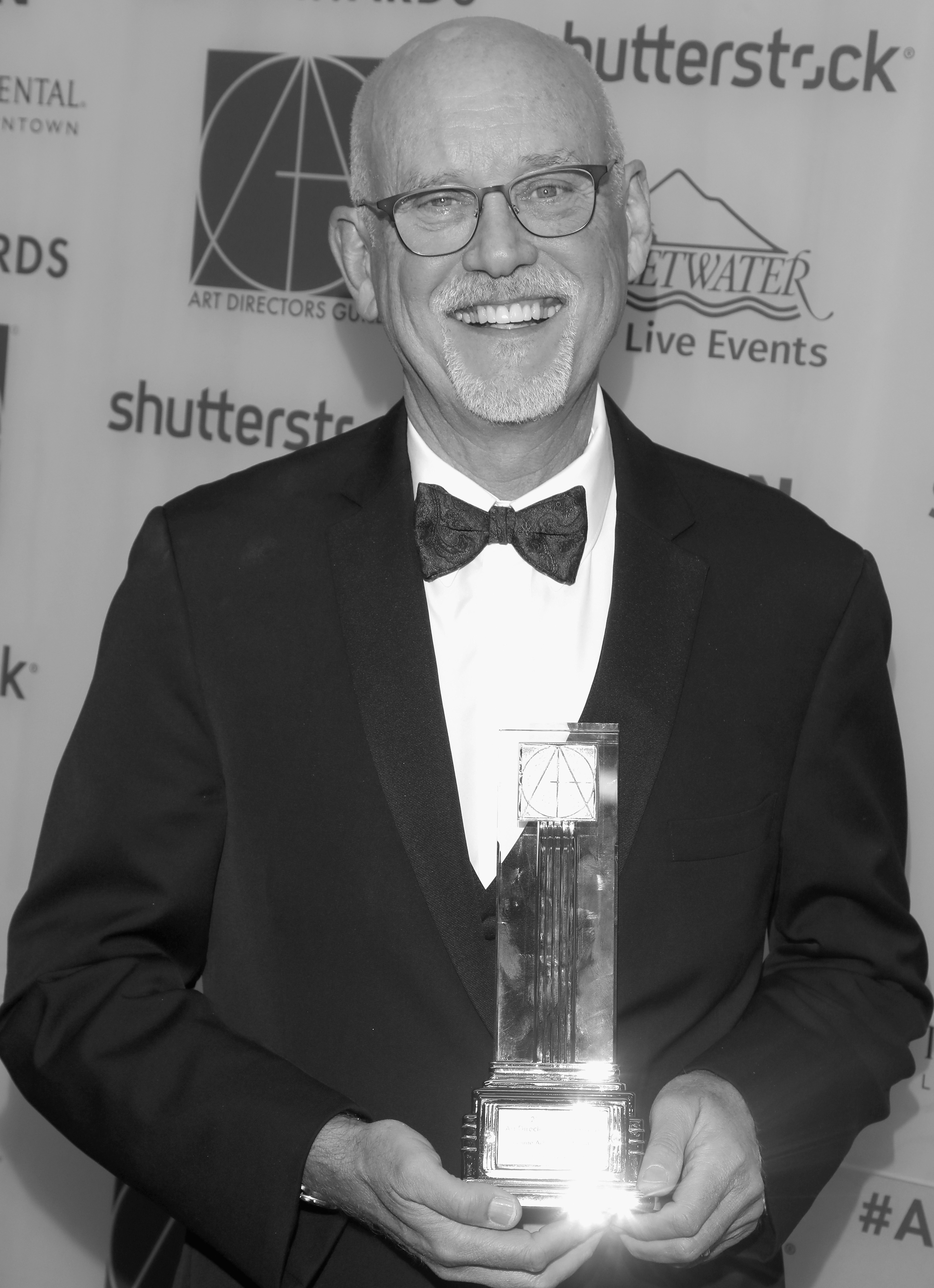
Patricio M. Farrell recently designed episodes for Steven Spielberg's reboot of the classic anthology "Amazing Stories", as well as "The Haunting of Hill House" directed by Mike Flanagan for Netflix, and the feature film "Yellow" directed by Nick Cassavetes. He has designed commercials for brands like Ray-Ban, Sony and Beck’s among others.
The first time I contemplated the possibility of working on a “horror” film, a genre that is not what I naturally gravitate to as a viewer, I concluded that my goal was still going to be to make the most beautiful sets possible. Beauty, of course, is in the eye of the beholder and one can find beauty in a flower as well as in a dead bird.
Since that first entry into the genre, I designed at least a couple more horror or “psychological thrillers”. As a general rule, I believe that in most cases, the sets are not what is supposed to be scary, but the action that takes place in them should be. The writer, the director, the talent within the environment we create should give you the chills.
A beautiful home that gives a sense of safety and warmth can become a lasting image in our minds, when something horrible happens within. In a way, it’s the difference between a scare and lasting trauma. Most of us would know to stay away from a scary old mansion on a rainy night and wouldn’t be surprised if our characters suffered some unworldly death while venturing into such a place. Most of us though, would go back to our homes after the show and find ourselves in a nice, safe and warm place..., just like the one in which our characters found an unworldly death.
In most cases, scripts of this genre will have a “secret basement” a “creepy attic”, one set or another that will naturally have to be eerie. There’s no way to create a space that has been forgotten, unused or purposely closed away for years or even decades without accumulating dust, gathering spider webs, being dark. Those elements by themselves would help give a sense of fright to any of us. Those are the cases when we might as well run with it and take full advantage of the opportunity.
The main challenge to translate this naturally scary nature of an environment, like a basement, into a great set, is not to fall into a caricature of the real thing. Extensive research and logic within the story is always essential in my work. We have poetic license on our side, we can push reality beyond the boundaries of the standard, but it is a delicate balance, since if we push too far, we would fall in the realm of the parody.
Getting the call to design Netflix’s “The Haunting of Hill House” was no doubt a great opportunity to conjure up all the years of Art Department experience onto one big show. As it happens, one of the most influential design decisions for the show came out of a problem, a necessity. Lack of stage space and the urgency to start building prompted me to present the idea of building Hill House as an actual house, with the second floor above the first one. This was a real proposal as well as a last call to get more stage space. A second story would bring rather big structural challenges, extra costs and limitations in terms of wilding some walls, ceiling pieces and also lighting concerns. On the other hand, it would provide the director the chance to follow the characters for as long as desired, up and down, to the right and to the left. Almost total freedom.
The advantages did win over the shortcomings and we ended up building the interior of an actual mansion on stage: over 15,000 square feet of uninterrupted sets. Hill House itself is one of the main characters. It is based on the ‘Robber Baron’ mansions of the late 1800’s, the era also known as the ‘gilded age’ of American architecture. We understood going in that it was going to be impossible to build such a monumental type mansion (think Hearst Castle) but knew that we were going to have to recreate it nonetheless. In order to achieve the much needed sense of scale, I started by breaking down areas, (ie, the foyer; extra ceiling heights at library and foyer) and different elements like the grand stairs, the living room’s fireplace, arches that could actually be extra large in scale and could help give the illusion of being in a much larger space than it actually was. The fact that we built Hill House as a real two-story house, added fluidity and realism. The careful alignment of hallways, arches, doors and stairs allowed viewing through several different rooms from one single point of view and added much needed depth.
Another main challenge was the need to translate Hill House's somewhat “schizophrenic” nature (as scripted) without ending up with some sort of parody. My intention was to create an enchanting work of architecture, an environment where every room, every corner, every crevice, would be able to help deliver a sense of awe and bewilderment. For that, I leaned on the vast wealth of architectural details and styles that were actually in vogue during the gilded age. By combining all these different components, using a mix of existing and custom-made moldings, panels, trims – plus the fabrication of every single door, window, finial, etc – we were able to achieve that needed mix of unsettling beauty.
No matter how overwhelming some projects may seem at the beginning, in my experience, it always comes down to breaking it all down. Set by set, wall by wall, detail by detail. It is only as we dismember each piece of the puzzle that the script presents to us, that we can move forward and start selecting each component that will bring it all together.
Ed Verreaux began his film career working for the legendary animation director Chuck Jones. As an illustrator, Verreaux worked with Steven Spielberg on “Raiders of the Lost Ark”, “Poltergeist”, “Empire of the Sun”, “The Color Purple” and a little film called “E.T.”. Verreaux production designed the film “Contact”, starring Jodi Foster and directed by Robert Zemeckis. Following that, he designed “Jurassic Park 3”, “Mission to Mars with Brian De Palma, “The Scorpion King” as well as several television pilots. His more recent credits include “Starsky & Hutch”, “X-Men 3 The Last Stand”, the motion capture project “Monster House”, again for Zemeckis and Spielberg, the comedy “Rush Hour 3”and “G.I.Joe, The Rise of Cobra”. He also has Production Designer credits on “Looper” with director Rian Johnson and “The Giver”. His most recent film is “Jurassic World”, directed by Colin Treverrow, produced by Frank Marshall and Steven Spielberg.
I’ve been fortunate enough to work on many films that deal in fantasy and what one friend once sarcastically called “Cosmic Eventualities”.
An eventuality that some people have been hoping for is making contact and being visited by intelligent alien life. Depending on how that first meeting goes you’re either in a positive feel good movie where the visitors are friendly (“E.T.”) or a horror, film where they’re not (“Alien” etc).
“E.T.” started out as a horror film. It wasn’t called “E.T.”, it was called “Night Skies”. About a ranch family isolated in the country, besieged by a group of Alien invaders intent on eviscerating their livestock, wrecking their homestead, stealing all the sugar and scaring the shit out of everyone, audience included.
I had worked on “Raiders of the Lost Arc” with Steven Spielberg in the spring of 1980. Steven and company went off to film “Raiders” in North Africa and London while I went off to several other projects that summer, most memorably working with John and Bo Derek on a film they were doing at M.G.M. (it was still called M.G.M. back then, not yet Sony) titled “Tarzan”.
During that summer I got a call from Kathy Kennedy in London wanting to know if I could spend some time boarding the VFX scenes for “Night Skies”. They were budgeting the movie in London and wanted a rough idea what the VFX cost would be and wanted a shot list based on storyboards. I guess they trusted me enough to board the script without any input from Steven at that phase. The boards would be for budgeting purposes only and could be changed, modified or gotten rid of later as Steven chose.
Rick Baker was designing the alien creatures and I spent 4 weeks at his creature shop becoming familiar with the look of the aliens that Rick and his team were creating, breaking down and boarding the scenes in question. Aside from meeting with Rick I also met Mitch Suskin on a daily basis. Mitch would later on become the VFX supervisor on E.T. as well as Splash, Cocoon and many others. Another VFX genius working there at that time was Hoyt Yatman who went on to create so truly stunning images on Bruckheimer films and others feature films and finally directing. Hoyt and I worked together briefly on “Mission to Mars" many years later.
So I did the storyboards and we sent them off to London.
Later that year Kathy called me again. Back in L.A. and Steven had changed the whole idea of “Night Skies”. It wasn’t going to be a scary Alien story any more but something less threatening, A story about a young boy who meets up with an extraordinary creature and has the adventure of a lifetime. Steven explained that he didn’t want to be scaring people about the possibility of contact with intelligent alien life from elsewhere in the Universe.
All the Rick Baker designs were scrapped and we began anew designing the E.T. character.
Carlo Rimbaldi and I began the designing process, drawing every day. Carlo would create one or two large elegant pastel drawings a day. They sometimes looked like one of the aliens from Close Encounters. I would draw 20 or 30 with pen & ink on smaller paper (note examples) to cover as much ground as I could. We’d meet with Steven every few days for his notes and feedback. I came up with the heart shaped face based on memory of a comic book I’d read as a kid where the alien spaceships were heart shaped. That’s how E.T. got his/her start. We spent many months refining and developing the look before a production designer or any other art dept people came onto the show.

Sharon Lomofsky studied architecture in South Africa where she worked in all aspects of commercial production design before moving to NYC in ’91. Her film and television production design credits include: "The First Purge" and "The Purge: Election Year", Hulu’s "Detour", the award-winning "Before The Rain" and "Robot and Frank", "Stephanie Daley", Oscar-award winning documentary "Man On A Wire" and the hit comedy "Bring It On". She is currently represented on the USA network with "Purge: The TV Series" and on TNT with "Claws".
Designing “The Purge” for TV was a lark I happened into after the lovely rom-com I was attached to lost its financing. I’ve never been a particular fan of the horror genre. I wasn’t even aware of the franchise prior to my agent pitching the job to me. To prepare for the interview I gave myself a crash course in horror, watching two-dozen horror films in five days and giving myself just as many sleepless nights in the process, obsessed with every creaking floorboard and ominous shadow.
For those few who are as ignorant of the franchise now as I was then, “The Purge” films are a dystopian horror franchise set in an America that has been taken over by a conservative, religious party of mostly white men called The New Founding Fathers of America. They institute an annual 12-hour, free-for-all lawless night called the Purge as a relief valve for middle-class economic stress and to cull the underclass.
Learning about the genre and the franchise to land the job was one thing. Designing the show after landing it was another beast altogether. My first reaction was that my own aesthetic sensibilities were not always aligned with all of the unfettered lawlessness and violence in the script. There were often times when I thought that what we were doing was not okay.
I was mostly able to set aside my misgivings by recognizing that the series had several strong female protagonists taking on the system and sometimes even winning. It also helped to focus on the subversive message underscored by gore: the questioning of the viability and sanctity of the American Dream. Is it alive and well? Was it ever? What is freedom? What is the cost of success? As an immigrant I found those timely questions worth asking and ones close to my heart.
Finally, I had come around to recognizing the sheer fun involved in designing for the horror genre. There was always something to build lurking around every corner, up every stairwell and down every street. The potential of building off the anxiety of a static-shot of a wide-open, quiet street on Purge night had become an almost irresistible siren song. After all, what’s more fun than designing a truly frightening haunted house?
Some of the TV show’s locations included a lavish mansion ballroom where the wealthy 1% held their annual Purge party, killing the poor for sport; a high-end financial firm where the competition for promotion takes a grisly turn; a tormented and disenfranchised factory worker’s home; the suburban homes of an aspiring middle-class architect couple living far beyond their means; the glowing blue school bus out of which a fanatical religious cult operated; and a working-class neighborhood Irish bar that served as a safehouse from the streets.
Without doubt the pièce de résistance was The Carnival of Flesh: a themed, tented festival of murder and mayhem. Officially called the BYGONE the carnival was referred to within the script as the Mac Donald’s of The Purge or Disneyland for psychopaths. The design premise was that it had to look like an ordinary carnival but simultaneously have a grisly, ethereal beauty to it. Most of the themes for the individual tents came from a short list from the writer’s room. Much of the design inspiration came from Robert Weine’s German Expressionist classic, “The Cabinet of Dr. Caligari” with its dark, twisted visuals and deliberate distortions in perspective, form, dimension and scale.
I also turned to historical research for inspiration and was struck by how much of what’s old becomes new again, especially in the realm of torture. It’s hard, perhaps impossible, to imagine anything more gruesome than the guillotine of the French Revolution; the Iron Maiden the Catholic church employed during the Spanish Inquisition; the hangman’s noose of the Wild West; the slave auctions and lynchings of the Deep South; and Nazi concentration camps and gas chambers. I also drew Inspiration from present day American prisons. Truth may or may not be stranger than fiction, but I can guarantee you it is more horrific.
At times I felt like Madame Tussaud at work in her chamber of horrors, replicating the inhumanity of mankind in waxworks of the past designed to reflect on the present and to scare the sh** out of you.
Of course, when you design for TV you’re designing for the censors , as much as for the audience, so I often had to dial back the gore. Then I had to dial it back some more. And then just a bit more. Who would have guessed this horror neophyte would have become obsessed to the point of having to tone it down? That and a budget to stay within. At the end of the day it’s probably just as well.
Although… (insert gunshots, evil laugh and muted screams of terror here!)
Jennifer Spence is a Canadian production designer based in LA. Her credits include the films: "Insidious" - chapters 2 and 3, "Paranormal Activity" - parts 2,3, and 4, "The Nun", "Annabelle: Creation" and the upcoming "Annabelle comes Home". She is currently working on "Conjuring 3".
When I read a script for the first time, I read it as though it’s just me sitting down to read a story. I am the audience. I take my time and focus on the characters and the story that is being told. See how it makes me feel…
The next time I read it it’s to focus on the locations and the characters. I’ve done a lot of horror movies. People often ask me If I worry about getting pigeon-holed into this category. My answer is absolutely not! Making horror movies is a very freeing experience. I get to push the limits in ways I couldn’t in a regular film. The challenge for me is always how to visually make it different and interesting. To ensure that I can tell something about each character by the space they inhabit. Some locations in a story are a character themselves. The trick is to visually tell the audience things about the place that are not spoken. Making movies for me is like make believe for grownups so it’s easy to love what I do. It also surrounds me with incredibly talented people. That in itself is inspiring.