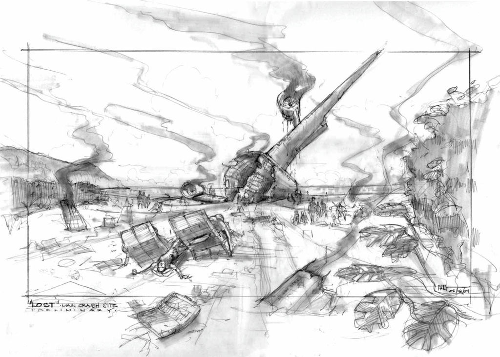
Sketching is thinking.
This is what I tell my students at UCLA where I teach Production Design in the School of Theater, Film and Television. Many of them find sketching difficult. They don’t like their sketches - to the point of embarrassment – something I think many of us struggle with.
My mentor Cletus Anderson, who was the leading force in the Set and Costume design program at Carnegie Mellon University’s School of Drama for over three decades, used to say that he disliked his own sketch work – and he was a masterful sketch artist and watercolorist.
What I tell my students is that the quality of the sketch as a finished piece of artwork is irrelevant, the point is, does the process of sketching help clarify, in your own mind, what you are trying to say with your design? Does it in turn communicate the idea of your design to others? If it does, it has served its purpose.
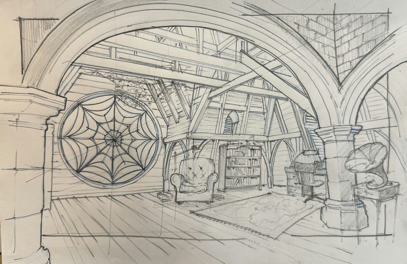
For me sketching is an essential part of my process, however ambivalent I feel about my own abilities, my best ideas come at the intersection of hand, pencil and paper. The simple, almost elemental space created at that intersection allows a contemplative focus that is precious for me in the always breakneck, overheated and distracted world that film-making has become. It is a barrier between me and the tendency for over-baked, under-considered design.
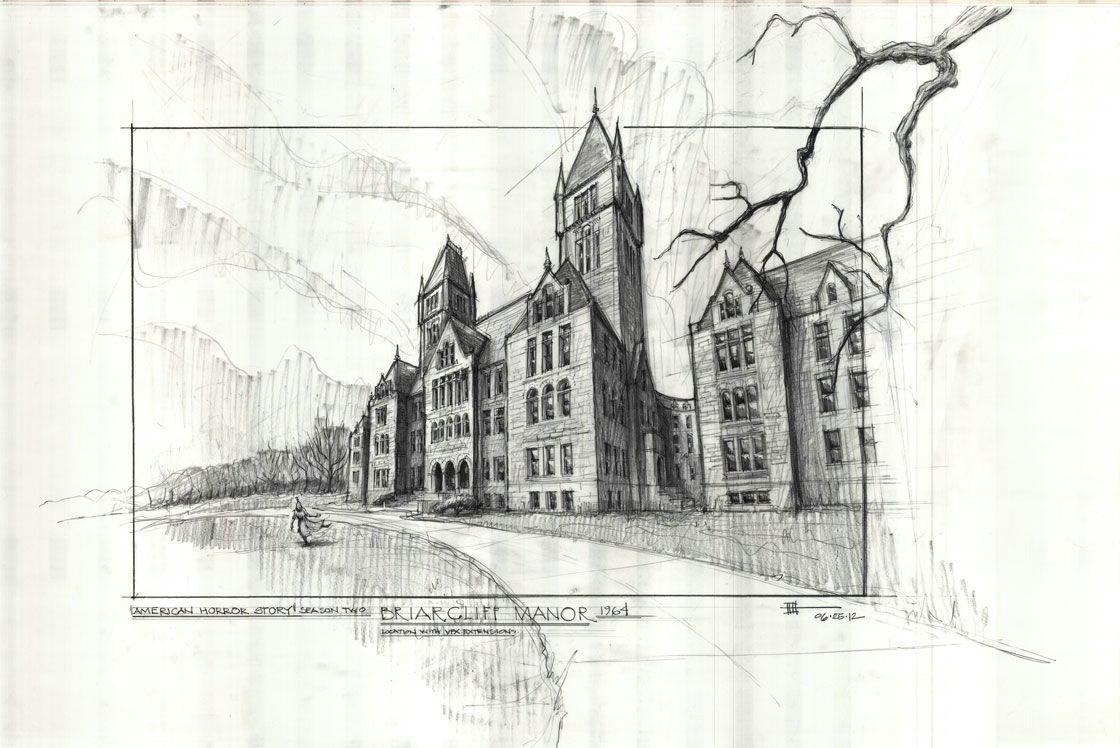
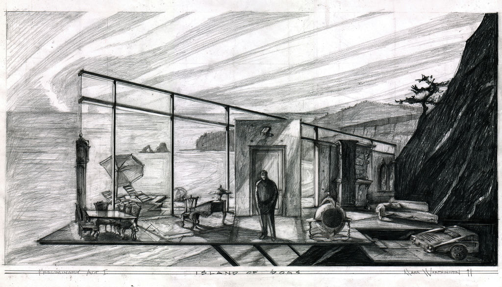
I find that the style of my sketches tends to change a bit with each project. I think the tone of a given script soaks in as I become immersed in the world it describes, and the nature of the sketches reflects this. So, for the early seasons of "American Horror Story" - "Murder House" and especially "Asylum" - my sketching became quite chiaroscuro, with heavy texture reflecting the dark tone of those narrative arcs.

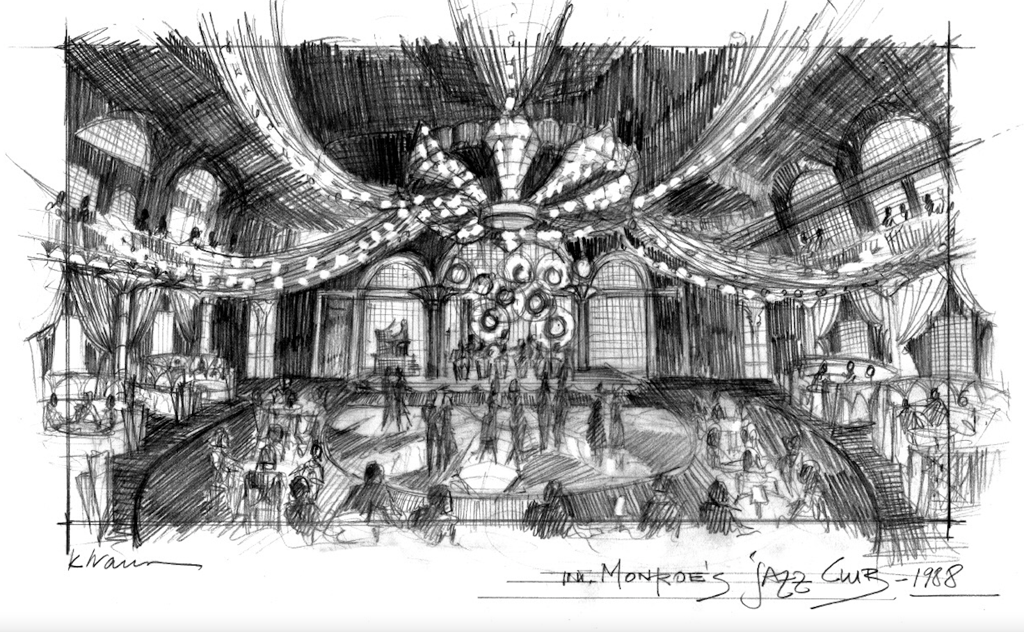
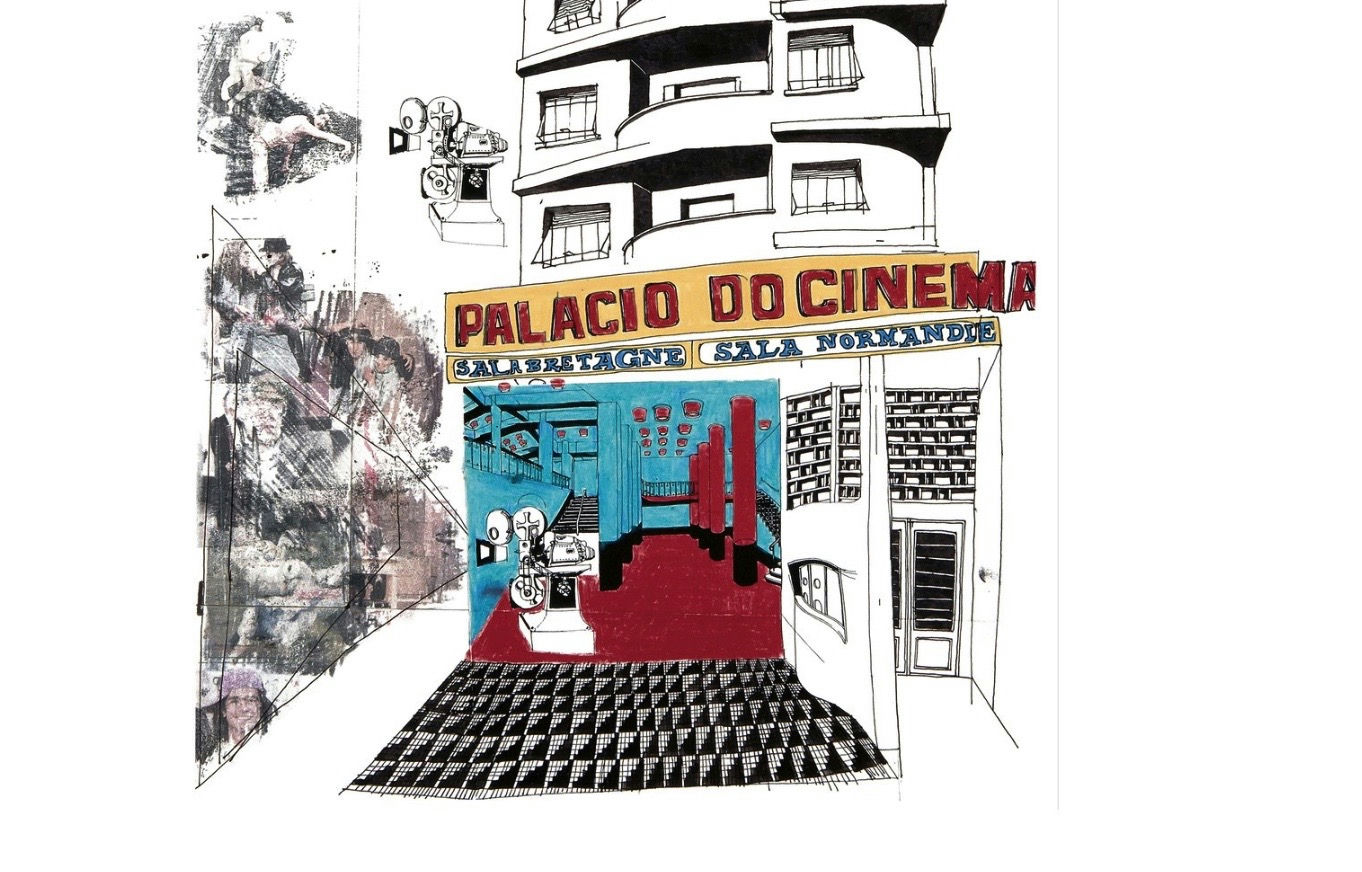
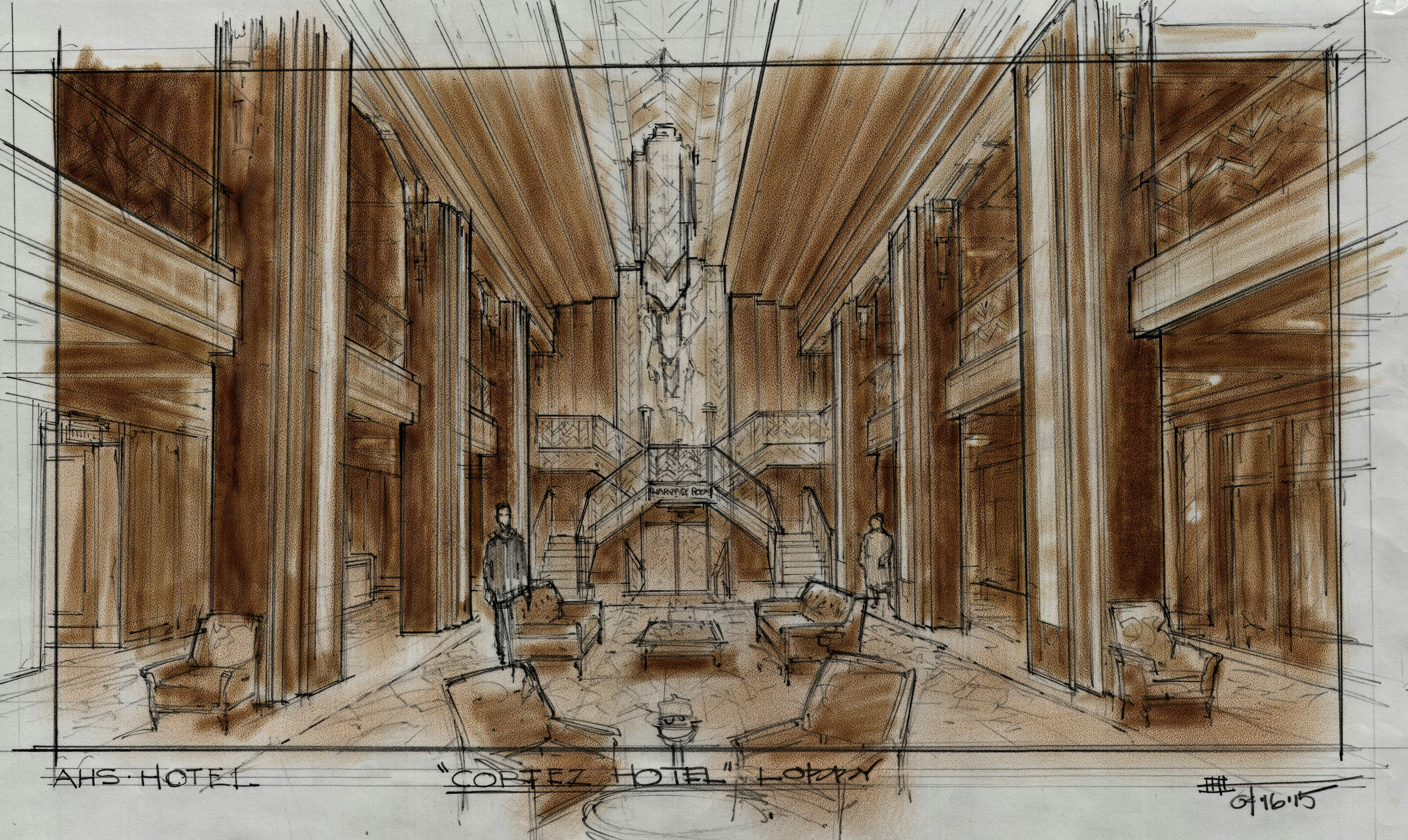
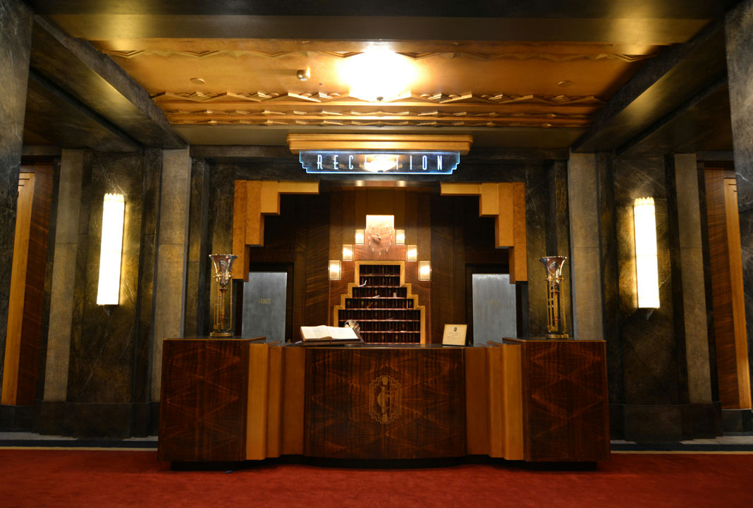
But then for "American Horror Story: Freakshow", color suddenly appeared, in part in response to the fact that the season was set effectively in a traveling circus but mainly as what I think was an intuitive response to the material. Someone commented on this fact while I was sketching for “Freakshow” and I had to admit that the lack color in the previous seasons was something that had not occurred to me, it seemed a natural response to the material. "American Horror Show: Hotel" needed color as well in the sketches to express the art deco opulence of the Hotel Cortez.
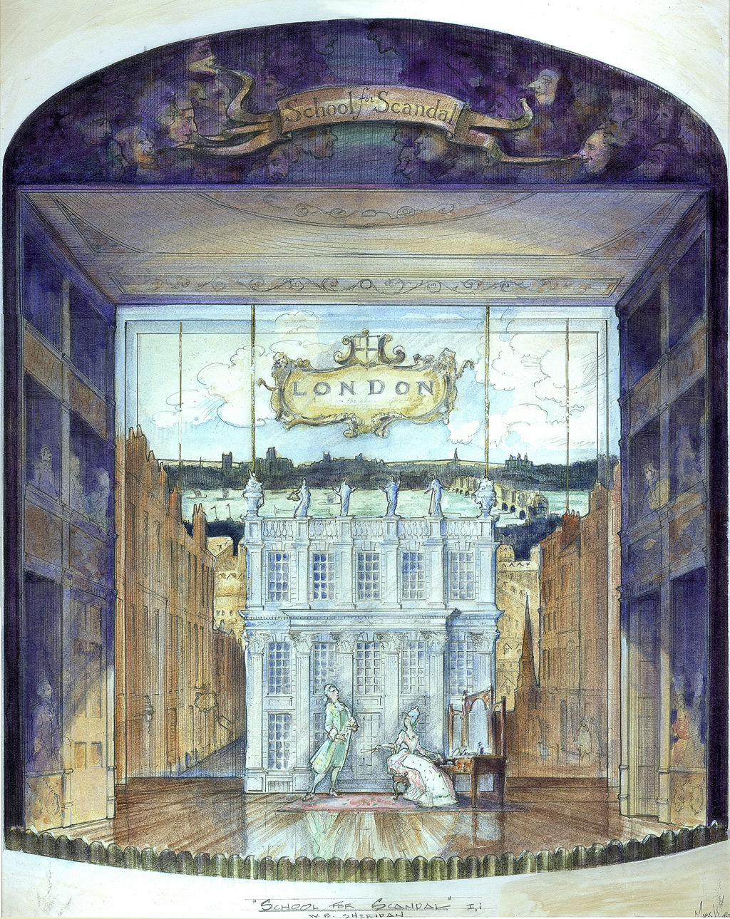
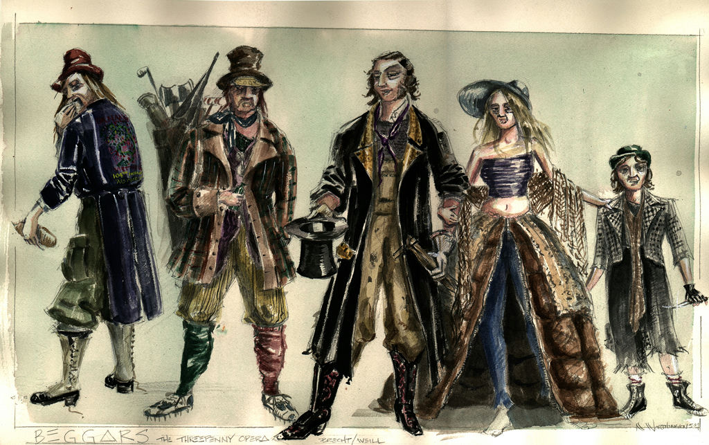
My original training was in set and costume design for theater and that experience has shaped my design approach to everything I have done subsequently. Costume design in particular trained my eye for texture and color, skills I use every day in my current work.
And I am constantly inspired by the work of other designers, both past and present. The deceptively simple lyricism of the sketches of William Cameron Menzies, John DeCuir Sr.’s startling and ravishing sense of color, the charm of Boris Levin’s work for West Side Story, the dynamism and strength of Ken Adams marker sketches for the Bond films and the work of so many of my contemporaries – all serve to spur me on to new ideas and approaches.
But in the end, all of this work - whether an artistic masterpiece in its own right or a humble napkin sketch – all bend to the primary purpose: a roadmap to the development of the final cinematic image.